To Buy or Not to Buy
Recently I found myself on the hunt for a new-to-me used car. After researching at places like Edmunds and Kelly Blue Book I proceeded to scour car dealers' websites for my preferred makes and models. Since this was my first time buying from a dealer I had a lot of questions. The questions I started out with were about the cars.
The questions I ended up with were about the websites.
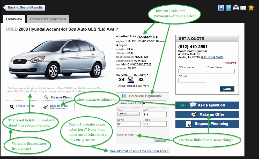
For example, I selected a car from South Point Hyundai's list of used cars and saw:
This is a partial list of questions I had while looking at the page:
The questions I had about the page as a car buyer fell into two general categories: how can I find information about this specific vehicle being offered (features, price, etc) and why are there different buttons and links that seem to be the same thing?
Now I assume that the goal of a car dealer's website is to get you to come in person to see the car you want and then, depending on the specific dealer's philosophy, possibly up-sell you to a newer, more expensive car.
Here's my redesign to address my questions as a car buyer while also focusing on the dealer's goal:
First to address the consumer's need for information specific to this vehicle:
Add more photos of the actual vehicle being offered.
List features and options available on this specific vehicle in the second tab (possibly renamed).
If the advertised price is not available place an obviously click-able link to request the price.
To minimize buyer's confusion and information overload:
Remove one of the "Make an Offer" links.
Remove the "Request More Information" link (the "Ask a Question" link provides the same service).
Consider hiding the "Calculate Payments" box on pages without an advertised price.
For the car dealer's goal to get you to come in person and possibly up-sell the purchase:
Give the top right highly prominent spot on the menu the command to "Test Drive Today".
Directly under that, list location specifics and the hours open. Presenting these details removes the need to click through to a different page and the need to determine which departments' hours are relevant. That means a buyer could drop everything to run to the dealer immediately without the need to wait for another web page to load.
Add a third tab at the top to provide the details of this year's version of this vehicle. This allows consumers to easily sell themselves on the newest model because it has all those extra features they want.
As for me, I did find the car I wanted at a different dealer, one whose website quickly and painlessly answered my questions.


